How to customize Attribute Components for styling products in Product Sheet Designer
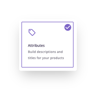
The Attribute Component allows you to add product attributes in a list format to your Product Sheet. This is ideal for titles, descriptions, and other text.
When editing the Attribute Component you will see different sections and settings. Here is an overview of what these are and how to use them.
*Skip to a section in this article by clicking on the links above
Attributes
This is found at the very bottom of the component editor to allow you to add unlimited attributes to the space. Add new attributes by clicking the '+ Add' button.
Add these first when editing your component in order to see them in the preview. This will make it easier to visualize the styles you apply.
You can rearrange the order of attributes by dragging and dropping them.
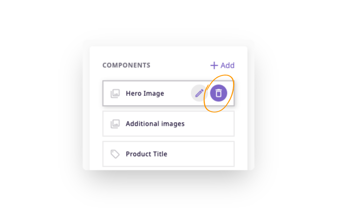
Remove attributes by hovering over the attribute and clicking the trash can icon.
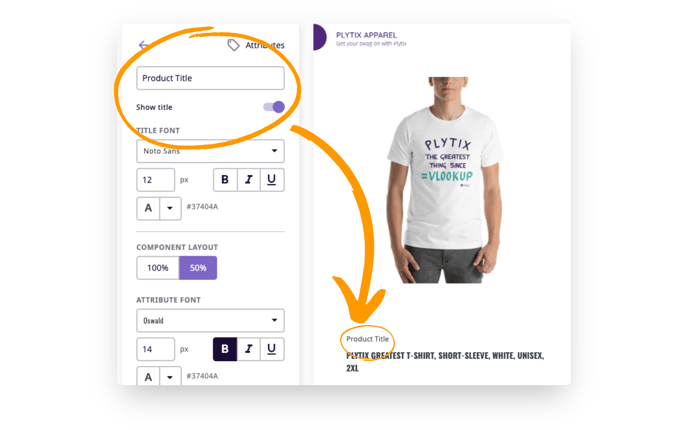
Title
The product title serves two purposes: (1) to identify the component in the component list, and (2) to be used within the template itself as a section header.
If you wish to show the product title as a section header, turn on the 'Show title' switcher.
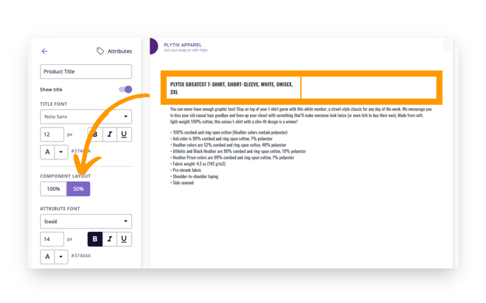
Component Layout
The Component Layout allows you to decide how much space the component will occupy. 100% will take the whole width of the page, while 50% will take half of the page.
When 50% is applied, there is space for another 50% component right next to it. This way you can create a description with an image next to it, or a two-column description.
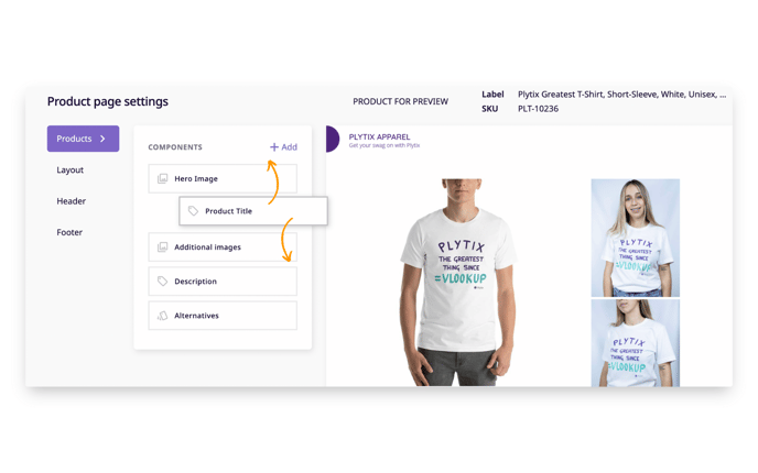
Here you can see the "Product Title" Attribute Component at 50% size.
Attribute Font
Here you can define the styles for the attributes you choose. You can customize the font, the font color, and the font size.
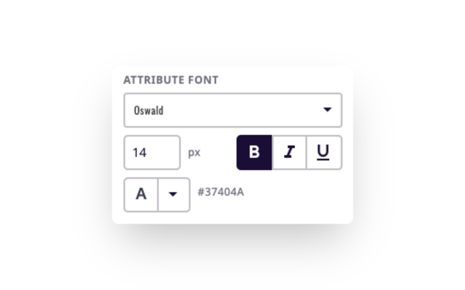
The minimum font size is 8 and there is no maximum.
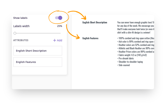
Show Labels
This switcher allows you to decide if you want the attribute label to appear in the template.
What's next?
- Learn about the gallery component in Product Sheet Designer
- Learn about the variations component in Product Sheet Designer
- Learn about static pages in Product Sheet Designer
If you have any questions just click on the chat box in the bottom-right corner and we'll be happy to answer them...
and please let us know 👇