How to use the Gallery Component in the Product Page Settings of the Product Sheet Designer to display images in your product sheets
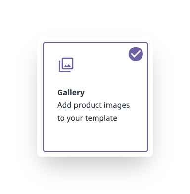
The Gallery Component is one of four types of components that can be found in the product page settings of the Product Sheet Designer. When designing your product sheet templates, you can use this component to add galleries of images to your template.
When editing the Gallery Component you will see five sections with various settings that are adjustable for each. These include:
*Skip to any section in this article by clicking on the links above
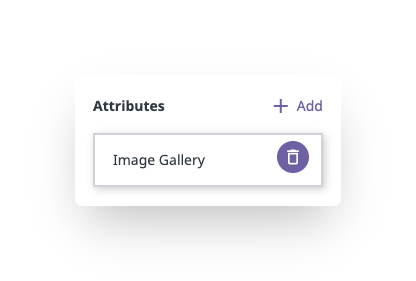
Attributes
At the very bottom of the component editor you can select a single attribute from which you want to pull your image gallery. As such, this will only show the media gallery attributes you have added to your product sheet in the 'Attributes' tab.
💡 Add a specific attribute before editing your component in order to see your images in the preview. This will make it easier to visualize the styles you apply.
Add a new attribute by clicking the ' + Add' button.
Remove an attribute by hovering over the attribute and clicking the trash can icon.
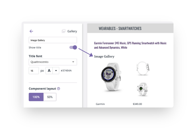
Title
The title serves two purposes: (1) to identify the component in the component list, and (2) to be used within the template itself as a section header, if desired.
If you wish to show the title as a section header, turn on the 'Show title' toggle as shown below. Turning on 'Show title' will also allow you to customize the font and size of the section header.
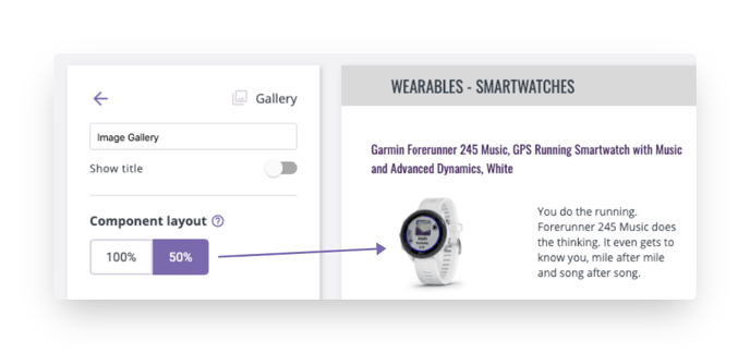
Component Layout
The Component Layout allows you to decide how much space the component will occupy. 100% will take the whole width of the column, while 50% will take half of the column.
When 50% is applied, there is space for another 50% component right next to it. This way you can create descriptions with images beside them, or double-column descriptions.
Here you can see a single image design Gallery Component at 50% with a 50% Attribute Component next to it:
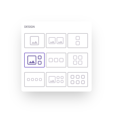
Design
There are nine pre-defined image layouts for gallery components. The maximum number of images that can be displayed at once is six.
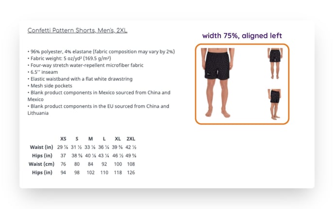
Width
The Width allows you to change the size of the images based on the space they occupy in the template.
100% will take the full width of the component space. 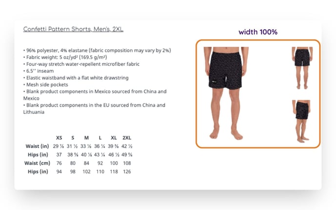
A setting below 100% will also allow you to set the alignment of the images right, left, or center.
What's next?
- Learn how to use the attribute component in the product sheet designer
- Learn how to use the variations component in the product sheet designer
- Learn how to use the relationships component in the product sheet designer
If you have any questions just click on the chat box in the bottom-right corner and we'll be happy to answer them...
and please let us know 👇