How to set up product variations tables on Product Sheets
The Variations Component allows you to add product variations in a table format.
When editing the Variations Component you will see different sections and settings. Here is an overview of what these are and how to use them.
*Skip to any section in this article by clicking on the links above
Attributes
This is found at the very bottom of the component editor to allow to add unlimited attributes to the space.
Add new attributes by clicking the '+ Add' button.
💡 Add attributes before editing your component in order to see the other customization options for this component.
You can rearrange the order of attributes by dragging and dropping them.
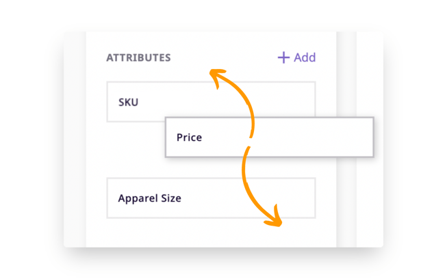
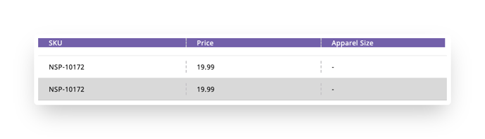
Rearranging attributes here will correspond to how they are laid out in the table. Attributes that are arranged from top to bottom in the list will be shown left to right in the table
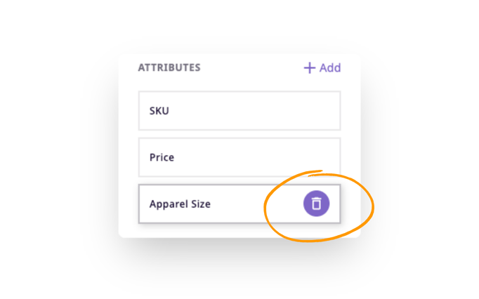
Remove attributes by hovering over the attribute and clicking the trash can icon that appears.
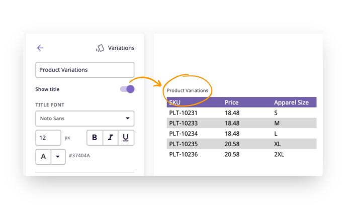
Title
The Title serves two purposes: (1) to identify the component in the component list, and (2) to be used within the template itself as a section header.
If you wish to show the Title as a section header, turn on the 'Show title' switcher.
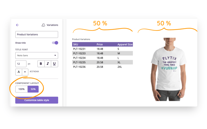
Component Layout
The Component Layout allows you to decide how much space the component will occupy. 100% will take the whole width of the column, while 50% will take half of the column.
When 50% is applied, there is space for another 50% component right next to it. This setting is not recommended for large tables with multi-column layouts due to space constraints, however, using the 50% layout in landscape or single-column designs can be useful.
See below an example of a small variations table next to an image:
Customize Table Style
The Variations Component has a table layout. Click the 'Customize table style' button to customize how the table looks. A pop up will appear showing the options available.
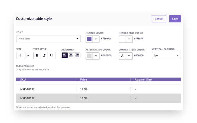
- Font - This is the font style for the whole table.
- Size - This controls the font size for the whole table.
- Text Style - Choose bold, italic, underlined, or a combination of these styles for all the text.
- Alignment - This is the text alignment for the whole table.
- Header color - Choose the color of the header bar.
- Header text color - Choose the text color in the header bar.
- Alternating color - Choose the color for alternating rows. Leave white if you do not want any color differences.
- Content text color - This is the color of the text in the rows under the header bar.
- Table preview - Here you will see your style options reflected. You can also drag the columns to change their width.
- Vertical Padding - This controls the vertical space within each row.
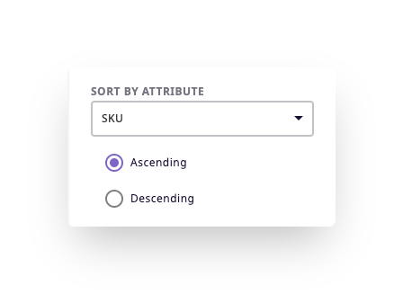
Sort by attribute
Here you can choose to sort the attributes automatically in the table. Choose the attribute you want to sort by and then if you want the order to be ascending (A to Z) or descending (Z to A).
What's next?
- Learn about the attribute component of product sheets
- Learn about the gallery component of product sheets
- Learn about the static pages component of product sheets
If you have any questions just click on the chat box in the bottom-right corner and we'll be happy to answer them...
and please let us know 👇