
You may want to create a Brand Portal for different use cases such as displaying a selection of products to customers, or working collaboratively with different teams in your company. Whatever your preferred use for your Brand Portal is, designing it in Plytix is simple. This article will walk you through all you can do using the Brand Portal customization features in Plytix.
*Skip to any section in this article by clicking on the links above
Branding
The Branding tab is where you define settings to make your portal match the rest of you brand.
Theme color
Here you can choose a brand and theme color. The brand color applies to the top banner of your Brand Portal while the theme color applies to some icons of the page, such as filter icons and the product and file selectors.
To configure your preferences, click on "Edit color" next to Brand color. The theme color is set by default based on your brand color, but you can configure your theme color manually by checking the box right below it. Once you check this option, the "Edit color" icon will pop up to configure your theme color too.

Slide through your brand and theme color pickers to select a color, its brightness, and its transparency; or switch between Hex or HSL to pick a specific color code.

Header
The header will sit above the top banner.
Display header - This can be toggled to show or hide your header. By turning this off, the title, subtitle, logo and header background will not be displayed on your Brand Portal.
Title - If added, it will sit in the top left of the header section.
Subtitle - This will sit right below the title.
Logo - This will appear in the top left of the header section pushing the header background to the right of it.
Header Background - This is the image that will appear in the header section on top of your Brand Portal.
To upload images to either your Logo or your Header Background you have two options:
- You can upload a new asset from your local device
- You can use an existing asset that is already stored in the PIM

⚠️ For the best looking outcome we recommend staying within the recommended image size (180x180 px for the logo and 1800x180 px for the header background).
Text Lines - Add custom text that will appear right below your social media icons to the right-hand side of the header. You can add up to three text lines.
Social Networks - Link your social media. Your social networks will be displayed with their social media icons at the top right of the header.

Layout
In the "Layout" tab, you can set product and asset filters, as well as sorting options, configure the search bar, and choose how to display your selected attributes.
Product Display Settings
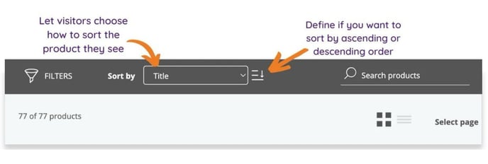
From here you can configure filters, sorting, and search bar options in the Products page of your Brand Portal.

Filters
Click on the settings icon next to filters to enter the filter settings. You can also turn filters on/off from here.
Once you enter the filter settings, a side window will pop up where you can configure your preferences. In this tab, you can:
- Choose to keep the filters expanded or collapsed as a default. Viewers of your portal can always expand/collapse them manually.
- Add new attributes to filter by. You can choose different attributes to add to your filter menu. For example, filter by product type, categories, size, color, etc.
- Drag and drop to choose the order in which filters will be displayed in your portal
- Edit your filter format

ℹ️ You can add up to 10 product attributes to filter by.
Note that you can choose attributes from the following types to filter by:
- Decimal and Integer
- Boolean
- Dropdown and Multi-select
- Categories
Click on an attribute to:
- Rename your filter title for output
- Choose the appearance of your attribute: tree, dropdown, list (see below: options vary based on attribute type).
- For Decimal and Integer attribute types: define a minimum and a maximum value
- For Boolean attribute types: define your values for "True" and "False"
| Filter type | Explanation | Example |
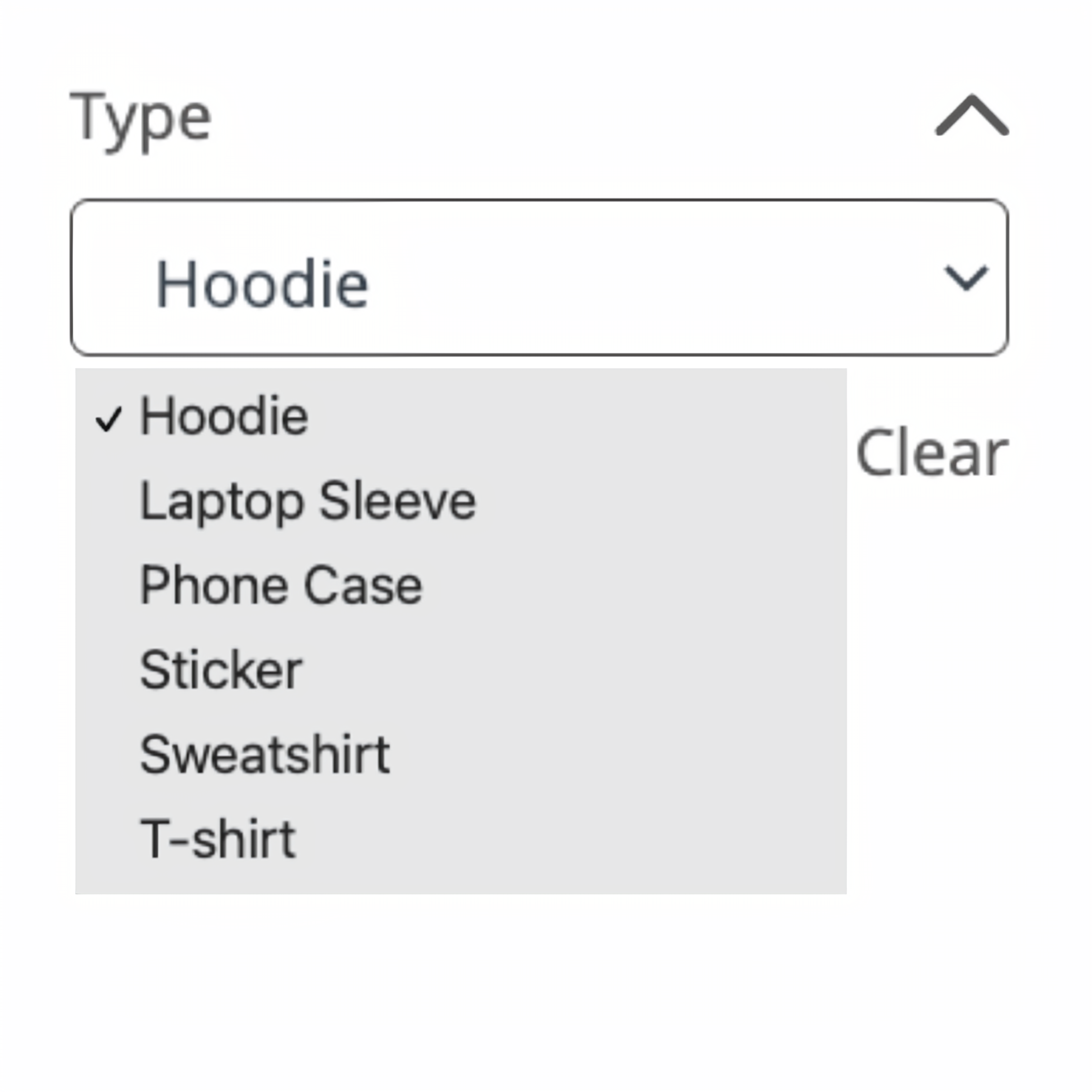
| Dropdown | The asset options will be shown in a dropdown and viewers can select one option to search by. |
|
| List** | Asset options will be shown in a multi-select list. | 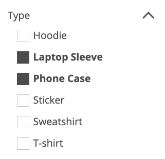 |
| Tree | In a tree, you can expand a group to show more options. This also allows for multiple selections. | 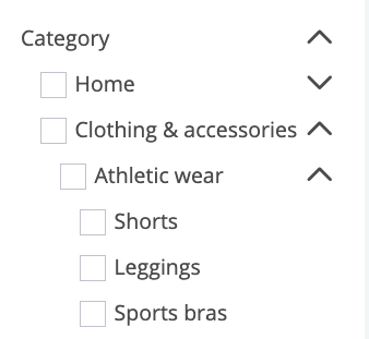 |
ℹ️ Note that list filters work with "OR" logic. This means that when selecting more than one option in a list, the filter will return products that fit any of the selected critera, not products that fit all selected criteria.
For example: If filtering for products that are A) waterproof and B) solar-powered, the results may contain products that fit both criteria, but will also contain products that are either waterproof OR solar-powered.
Sorting
Adding sorting options allows you to select the default sorting of your products or allow viewer to choose their own sorting.
When the sorting option is off, you can choose the default sorting by selecting an attribute to sort by and whether the order will be Ascending or Descending.
When the sorting option is on, you are allowing viewers to choose their custom sorting. You can select up to 5 attributes to sort by which viewers can then choose when navigating your Brand Portal. For example, by ascending or descending price, name, weight, etc. This will be added to the top banner of your portal.

ℹ️ You can add up to 5 attributes to sort by.
ℹ️ You can select up to 5 attributes to sort by.
Search bar
If you choose to activate the search bar, you can select up to 2 attributes visitors can search your portal by (e.g. Title and SKU).

The help text you edit will show up in your Brand Portal's search bar:
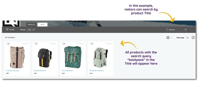
💡 Keep "help text" to 22 characters to ensure it's not cut off.
Other Display Settings
Grid size - Select the size of products in grid view.
⚠️ Grid can affect how many products visitors see per line.
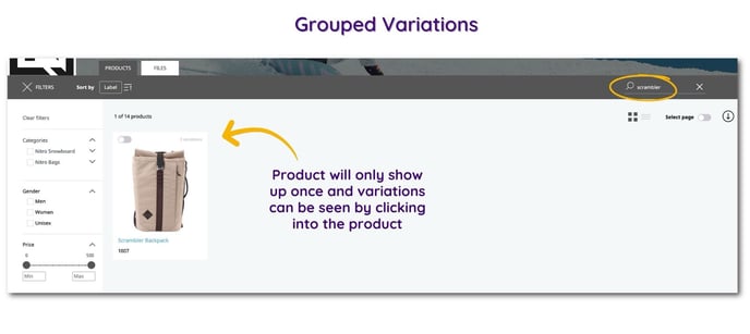
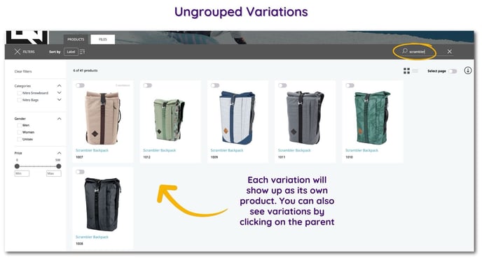
Group variations with parent - This will define how visitors see products with variations: grouped with the parent product or displayed separately.

See below an example of how grouped variations would be displayed compared to ungrouped variations:
Asset Display Settings
Here you can configure the settings for your Assets page in your Brand Portal.
- Filters
- Sorting
- Search Bar: Toggle on the search bar to display it, so that users can search by asset name.
- Grid Size: Select your preferred size for grid size.
⚠️ Grid can affect how many products visitors see per line.

Filters
Here you have the option of adding the "Categories" system attribute to use as a filter. Click on the pencil icon to configure how it will be displayed.
Turning on filters allows visitors to filter through assets. This can help them find what they are looking for, faster. To do this, add the "Category" system attribute. Click on the pencil icon to configure how it will be displayed.
Now you can
- Rename the label
- Define how to display it (as a tree, or dropdown), and
- Set which level to begin the filter tree from.

ℹ️ Unlike product filters, you can only filter files by categories in your Brand Portal.
Sorting
In the sorting section you can decide how your assets should be sorted.
- You can select to sort by up to three attributes among the options of "Last modified", "Created", and "Asset name"
- Drag and drop the attributes to reorder how they will be displayed in your Asset navigation banner.
- Select if the sorting is "Ascending" or "Descending" for each sorting attribute
.jpg?width=688&height=331&name=assets-layout_sorting-setting%20(2).jpg)
Product Content
In this section you can configure what product information will be displayed both on the Product Overview Page and the Product Detail pages of your portal.
General Settings
This is where you will choose the information that will be displayed about your products.

Product title - Choose which attribute to use for your product title (the text that is shown below the product thumbnail).
ℹ️ Product title is limited to short-text attributes.
Product Gallery - Choose a media gallery type of attribute to display more images of your product. If you check the box "Use this attribute as featured image", the first image in the Media Gallery you selected will be used as the product's thumbnail.
Product thumbnail - Here you can select what media attribute you want to use as the featured product image. Let the system take the first image of the product gallery and make it your overview thumbnail, or select a specific image attribute to use.
Featured attributes - You can choose up to 5 additional attributes to include beneath the thumbnail of each product.
ℹ️ The first 3 featured attributes will be displayed in the Products Overview page of your portal, and all 5 added attributes will be displayed in the Product Detail page.
⚠️ Please note that HTML attributes are not currently supported as featured attributes in Brand Portals.
Detail Settings
In this section you will configure which additional information to display in a product's detail page of your portal.

Autofill Content
When autofill is switched on, the system will show all attributes loaded in the Brand Portal settings. You can then choose if you want to organize these attributes by attribute groups or not. When organizing attributes by group, the attributes will be in the same order as shown in the attribute groups settings. If you choose to not organize attributes by group, attributes will be displayed in alphabetical order of the output label.
⚠️ The ordering of attributes is case sensitive meaning all attributes that are capitalized will show first.
When autofill is switched off, you can customize which additional components to show, and drag and drop them in the order you want.

Components
Components are sections added below the product header. You can name these sections however you want and they can include attributes, galleries, variations, and relationships. Each component has its own additional settings, and you can drag and drop these components in whatever order you'd like.
| Attributes component |
|
| Gallery component |
|
| Variations component |
|
| Relationships component |
|
ℹ️ Learn more about how to add relationships to your Brand Portals.
What now?
- Learn how to add product relationships to your Brand Portal
- Learn how to embed a Brand Portal into your website
- Learn how to navigate your Brand Portal
Is there anything you were hoping to find in this article that is missing? Did this article answer the questions you had? Let us know in our Help Center feedback form! 🙌